Type: Personal project
Based on: Stem cell therapies for neurological disorders: current progress, challenges and future perspectives by Ramyar Rahimi Darehbagh et al.
Field: Regenerative neuroscience / cell therapy
Figure type: Multi-panel review summary
Why I made it
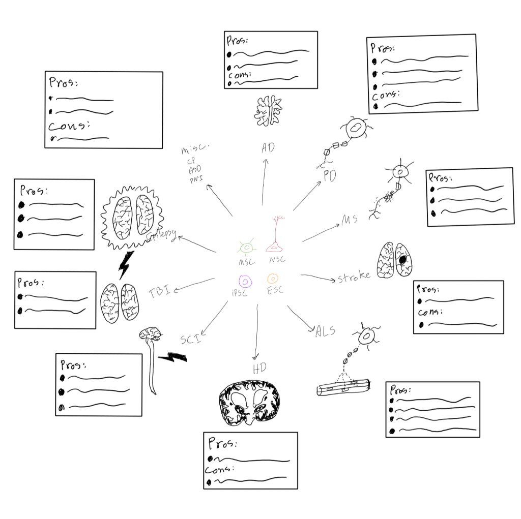
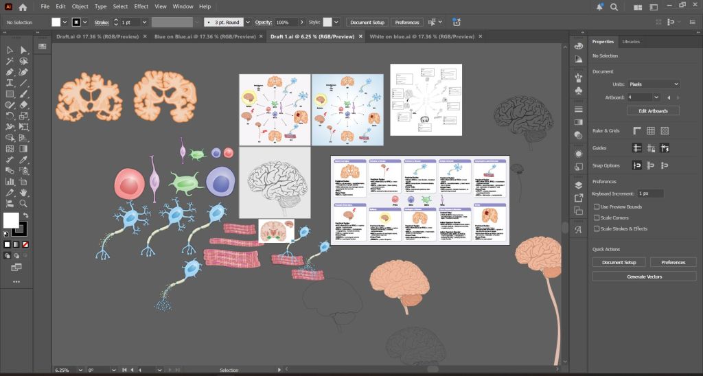
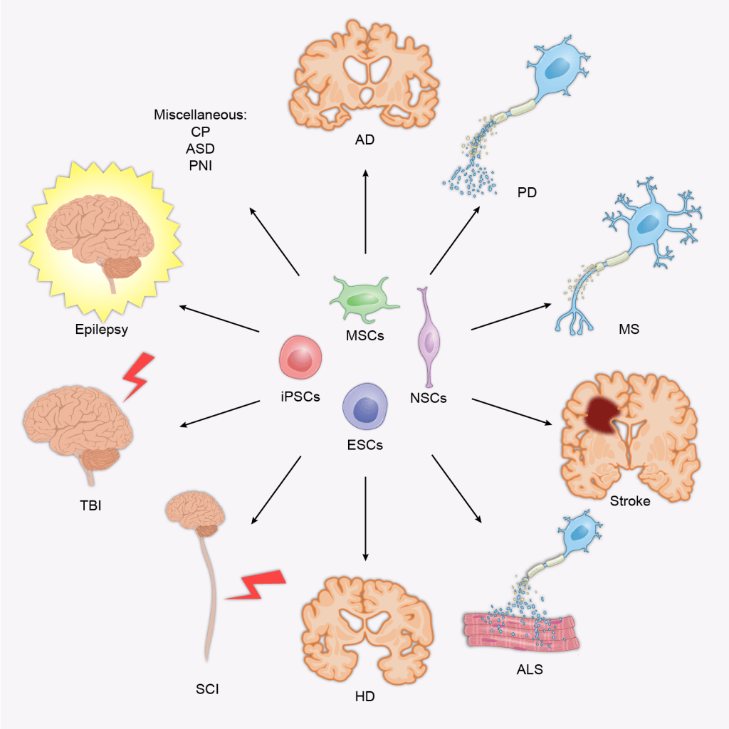
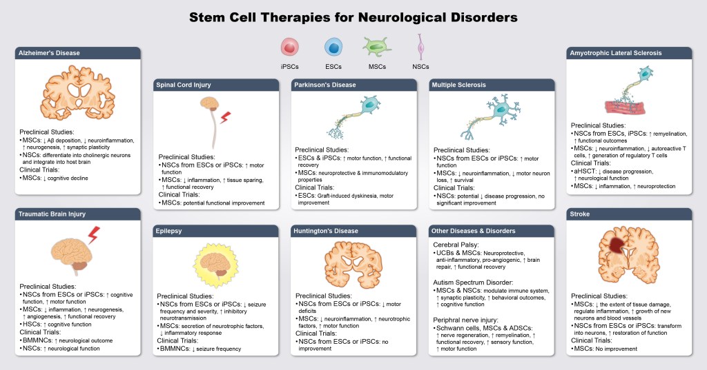
I enjoyed reading this review and wanted to test a question that comes up with almost every review figure: how much of a broad paper can fit into one image without losing the reader? The review covers ten neurological conditions, four stem cell types, and both animal and human evidence.
The challenge
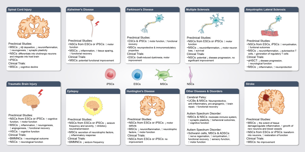
Ten diseases is a lot of panels. If each one had its own layout, the reader would have to relearn the figure ten times. The figure also had to separate preclinical results from clinical trial results, because the two often disagree.
My approach
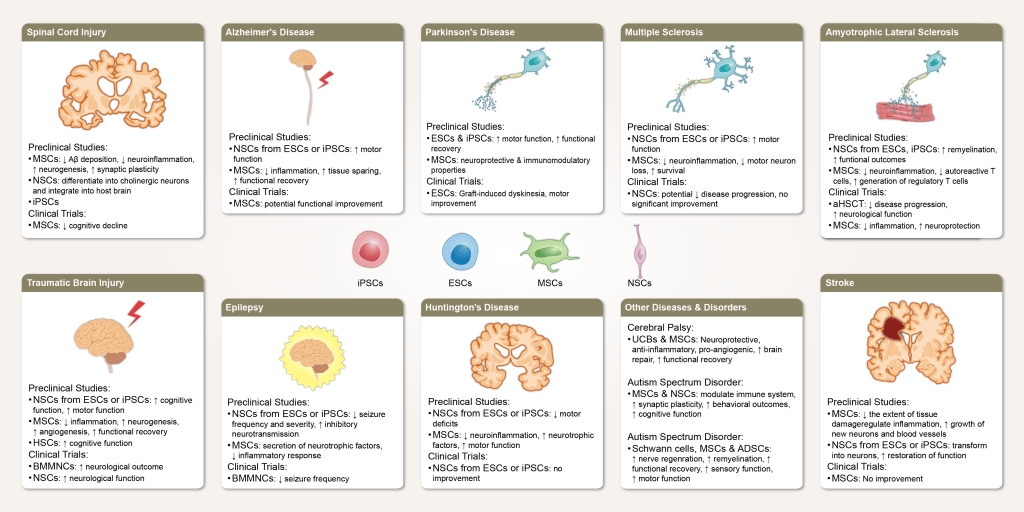
One template for every disease: each panel has the same structure: a simple anatomical icon, then “Preclinical studies” and “Clinical trials” with the cell type and its effect. Once the reader understands one panel, they can read all ten.
A shared cell-type legend: iPSCs, ESCs, MSCs, and NSCs are drawn once at the top, so the panels can refer to them by name without repeating icons.
Arrows instead of sentences: ↑ and ↓ show improvement or reduction, which keeps each finding to a single line.
Testing the color scheme
For the second draft I tried two backgrounds side by side, a cool grey and a warm bone tone, to see which made the colored icons easier to read. The final version uses a light grey that keeps the panels calm and lets the anatomy stand out.
The result
A single figure that summarizes a long review in a format readers can scan disease by disease. The same template approach works for any review that compares one intervention across many conditions.
Writing a review that covers a lot of ground? Start a project →